
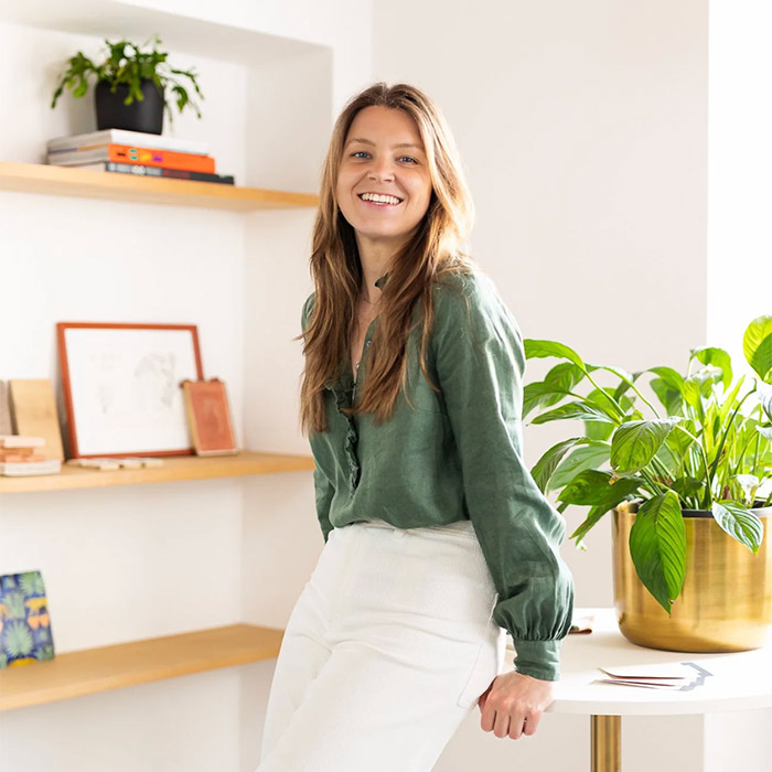
In her reflections on Milan Design Week, Charlotte Cropper, colour consultant and IDO graduate, offers a considered, personal reading of what colour trends stood out across the city.
Milan Design Week is interpreted through many lenses, and colour is no exception. While global authorities like Pantone analyse the event through a future-facing trend perspective, scanning for signals across industries, Charlotte’s observations highlight how colour at MDW is never singular or fixed. It’s filtered through individual experience, and her perspective is shaped by what feels relevant and resonant in real interiors.
Olive & Chartreuse
Green for me was one of the main players this year. A rich olive was prominent across the board, coming through in larger furniture, wallpaper and textiles, but it was peppered with acidic lime and chartreuse accents in armchairs, coffee tables and even the styling props.

Wine Red
Deep wine red is still holding strong as a key colour in interiors (hello red thread theory). Last year it was bold, confident and colour-drenched, but this year it was pared back to accents in small side tables, lamps, rugs, lampshades, fringing on armchairs and beds, and even piping on cushions.

Dusty Cornflower Blue
It’s hard to pin down the exact tone of blue this year, but one blue in particular that caught my eye was Studio Ashby’s sofa at Alcova. It’s a beautiful mid-tone blue muted with grey. The sofa was paired with an olive throw and a deep terracotta rug, showing just how well these colours work together.
I was also really drawn to the naturally dyed threads in one of my favourite exhibitions, Variations, showcasing a calming palette of dusty blues and natural beiges. A lady behind me said, ‘Ohh, I love those colours. It’s like the perfect summer palette,’ and she wasn’t wrong.

Chocolate Brown
I was very happy to see brown still going strong. I’m a complete convert and think this is the most gorgeous colour to introduce in a scheme when you’re looking for depth and a touch of darkness to anchor a space, without having to go black.
Again, there were a few different shades of brown, but one of my top picks was rich chocolate brown. It came through in sofas, tiles, lamps and even carpets! Then of course, there are the natural brown tones (which I particularly love) in exposed wood, such as walnut, rosewood and mahogany.

Deep Terracotta
Terracotta is totally timeless. I think I see this colour everywhere, regardless of whether it’s in trend, because I love it so much and am constantly drawn to it. I’ve noticed that it has a touch more black in it as the years pass, getting muddier and richer, which I love. This year I noticed terracotta sofas, rugs, floor tiles and even the backdrop of many exhibitions, which, although it isn’t necessarily done on purpose, I have no doubt will influence the colours we see in the shops.

The accent colours
You might know the 60-30-10 rule in interior design. If olive green, brown, terracotta and wine red make up the 60% (the grounding tones that shape a space and give it depth), chartreuse and dusty cornflower blue are our 30 (adding contrast and lift without overwhelming), and 10 are the accents: splashes of lime green, moments of rich ochre yellow and the occasional hit of fuchsia pink.
Ochre yellow wasn’t something I noticed much in person, but it’s been hard to ignore online, threading its way through different collections. Saturated fuchsia pink, on the other hand, was impossible to miss and I have a feeling it will be popping up in trend forecasts very soon.
Final thoughts
I felt that this year, nothing felt overly new. These colours didn’t feel ‘trendy’, they felt familiar, perhaps becoming richer, muddier and more nuanced, which, if I’m being honest, I loved. We’re all craving homes that feel timeless and have a sense of longevity, and colour plays a huge part in that.
Curious to read more?
This was written by Charlotte Cropper and first published on her Substack where the full article is available (click here). For the lastest on her musings, travels and projects, follow Charlotte on Instagram @charlottecropperdesign
Charlotte studied our colour courses. Find out about them here.